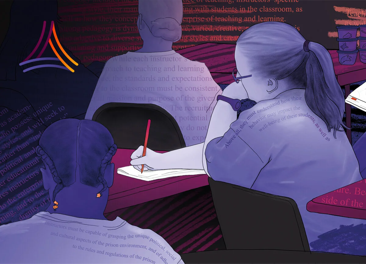


Blue Marble has been a key partner throughout the development of the product/Ux and brand communications for both EdReady and its parent organization (NROC) going back over 12 years…learn more.
Blue Marble has been a key partner throughout the development of the product/Ux and brand communications for both EdReady and its parent organization (NROC) going back over 12 years…learn more.
From launching a new brand and website in March of 2020 through the first few years of growth with many different projects, initiatives, and events, we’ve provided creative/technical services and guidance…learn more.

SOQ (brochure) cover

Proposal interior spread with stylized process graphics
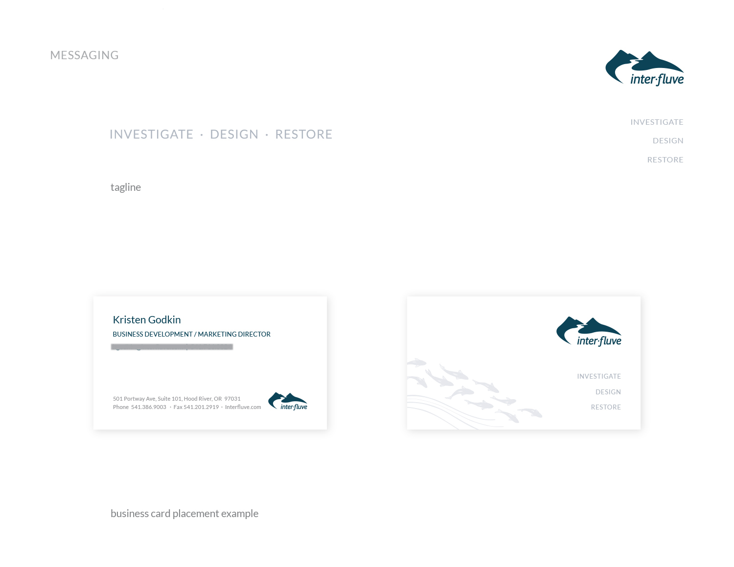
Inter-Fluve is an interdisciplinary firm specializing in investigations, design, and restoration of rivers, lakes, and wetlands. As pioneers in their field, they develop solutions to complex aquatic challenges while balancing human and environmental needs. With over 1,600 successful projects across 4 continents and all regions of the United States, Inter-Fluve is challenged to communicate the depth and breadth of their excellent work.
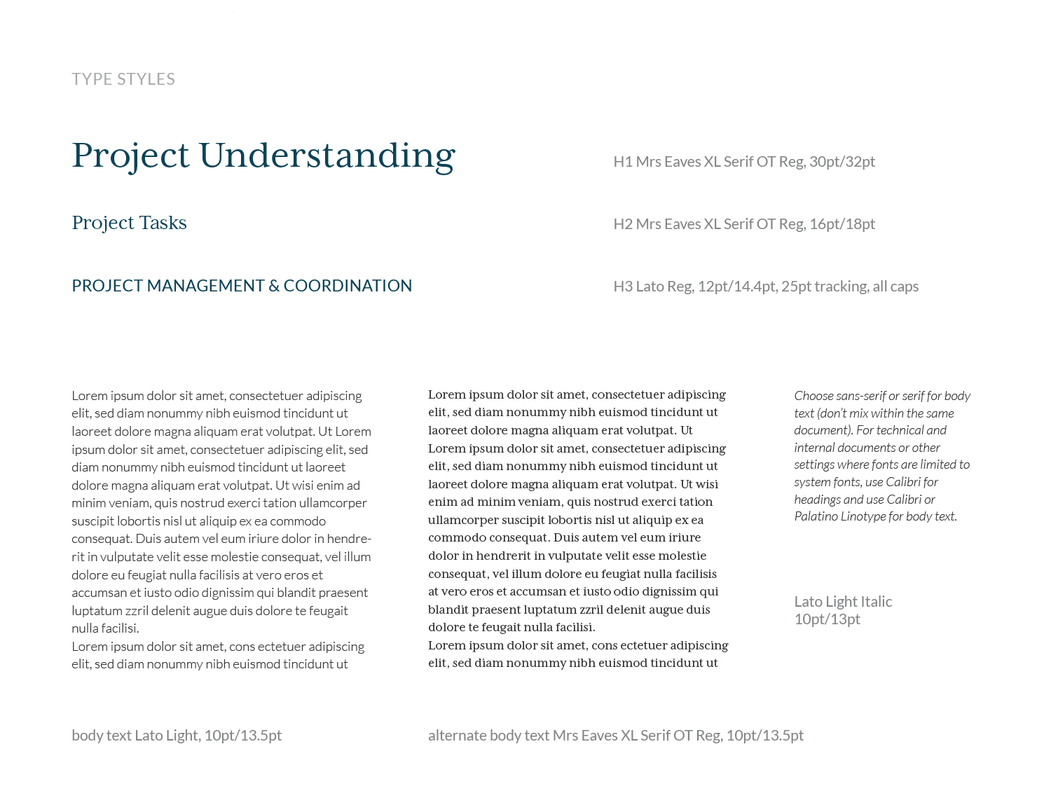
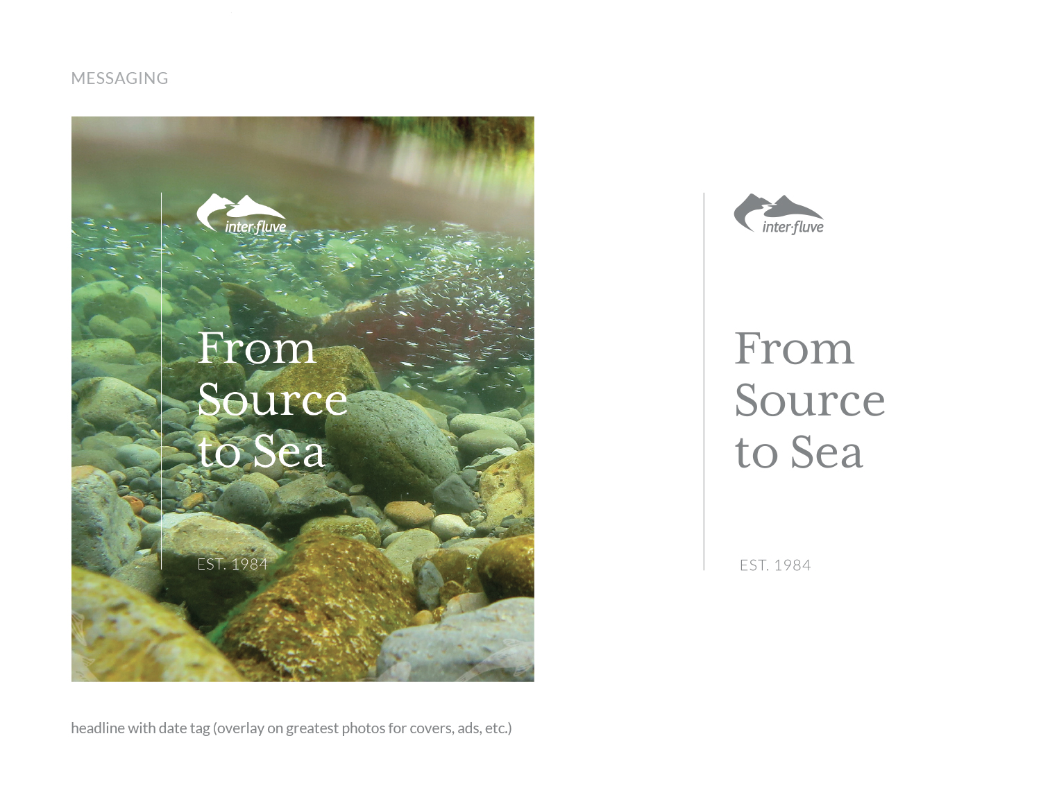
The firm had worked with Blue Marble in 2013 on a variety of printed materials. Inter-Fluve used the guidance and design tools we provided for five years, then engaged our services again in 2019. The above images show a few examples from an extensive body of work, including InDesign templates for long proposals and the company’s Statement of Qualifications.
Inter-Fluve marketing staff have a variety of new tools and skills at their disposal. The firm looks forward to strong growth while also staying true to their roots.
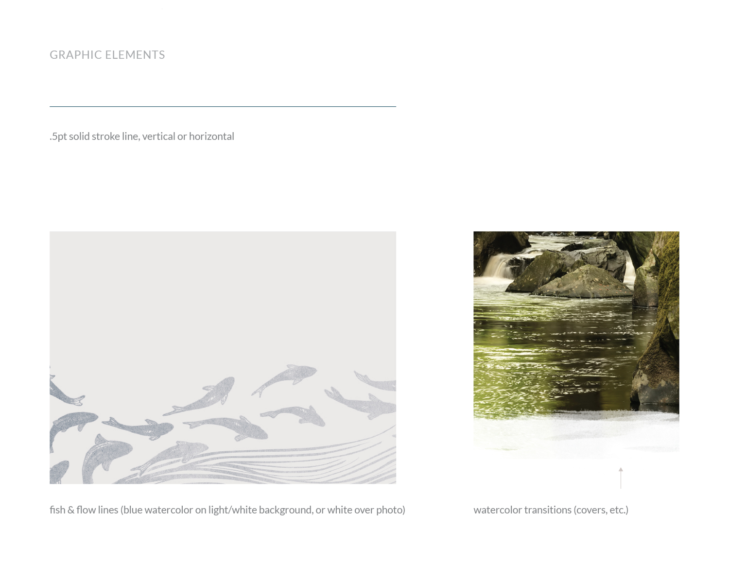
Original fish and milestones vector illustrations by Maisie Richards of Inter-Fluve (reconfigured and stylized by Blue Marble)
“Clients and employees have been impressed with our materials. BMC did a great job in completing what we asked of you. The templates are elegant yet simple; they make the company look good. Just as important, I think they make employees feel proud of the product they are creating.
– Jonathan Graca, Marketing and Field Technician, Inter-Fluve
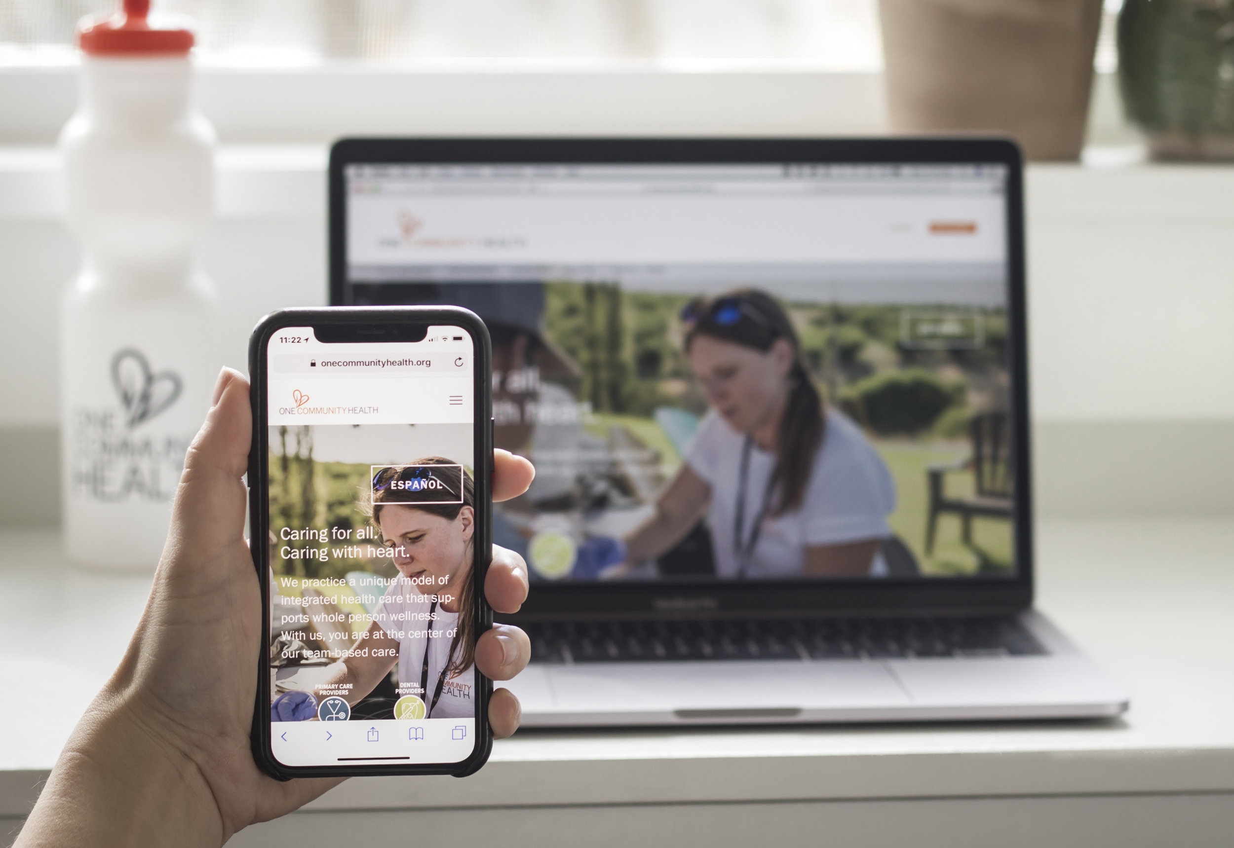
One Community Health reached out to Blue Marble in late 2016 for help with a new website. This federally funded community health center serves all people, regardless of their ability to pay. The health center was urgently in need of a more effective presence online. Their website had been neglected for years and was becoming an obstacle to sharing information.
Upon meeting with the leadership of One Community Health, it became clear that affordability of services was just one of the many remarkable aspects of their offerings. Blue Marble was challenged with the task to convey that affordability and inclusiveness in no way translates to a sacrifice in quality. In fact, One Community Health’s unique whole-person approach is cutting-edge.
The leadership team's goals included:
greater visibility for their integrated approach to care
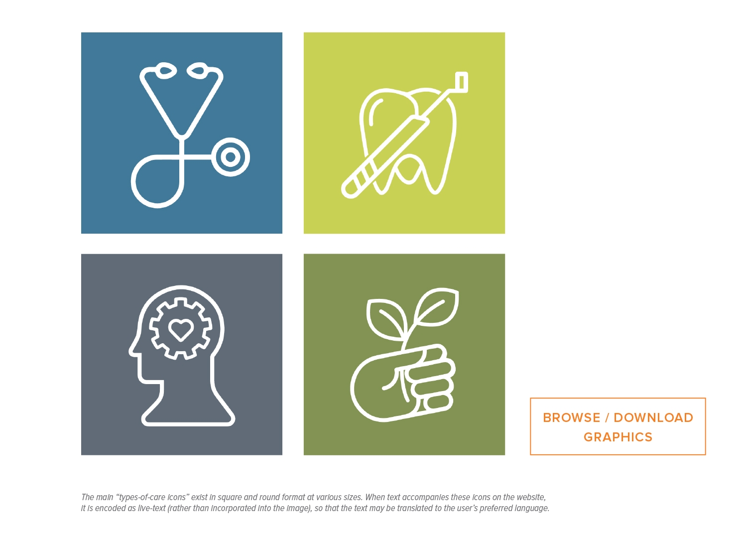
emphasizing a brand new element of care—Behavioral Health
Spanish and English language versions of the website without an excessive maintenance burden on staff
Accessibility to mobile devices
A structure for ongoing publication of health resources and other articles
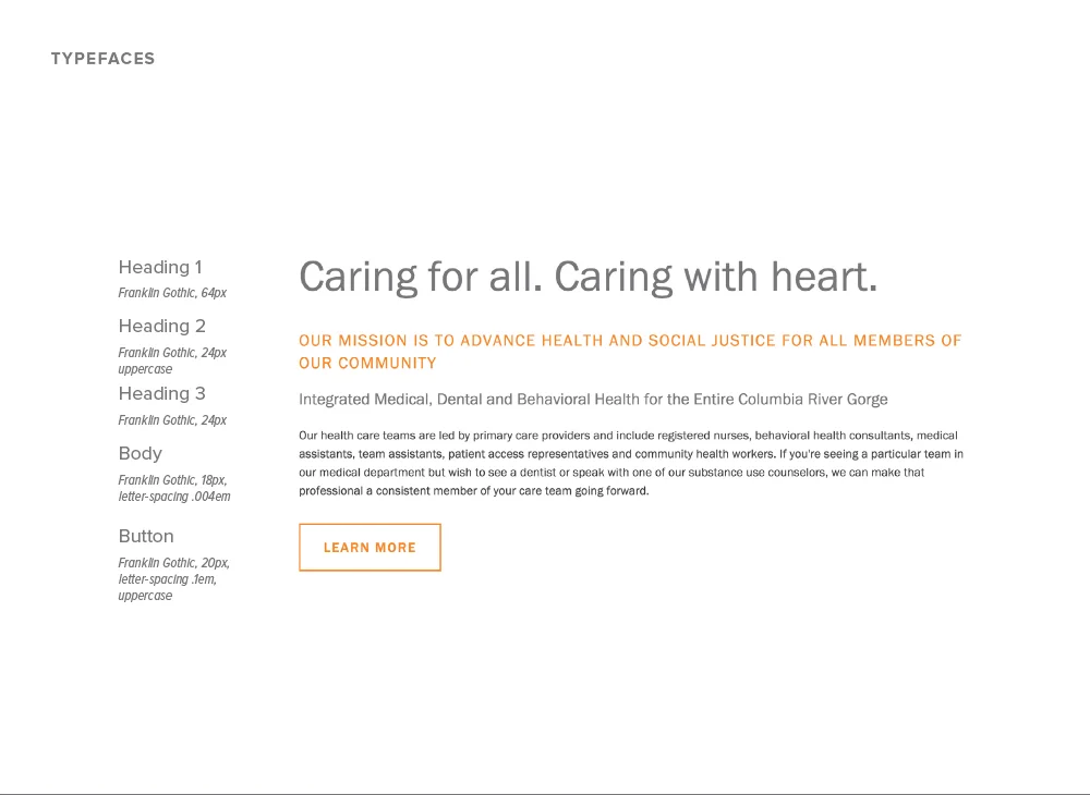
Thoughtful information architecture made sense of the offerings and provided scaffolding for an extensive re-write of the content in collaboration with Katie Roberts.
A user-friendly content management system (CMS), has allowed the site to grow and change, thus making updates possible for OCH in-house and non-technical staff members.
The graphics and icons we developed convey the idea of whole-person health and its various components. These provide consistency across all media.
We coordinated and directed three days of on-site photography to produce a library of authentic, professional photos to reinforce key messages.
We created a brand guide and a detailed website handbook along with ongoing training and technical support, empowering OCH to bring website and brand management in-house.
The concept we suggested for an all-staff heart photo was completed in less than 20-minutes due to our careful planning beforehand, saving valuable time and staff resources. We accomplished this by scouting the site in advance multiple times, securing a cherry-picker, and developing a 3d model based on the anticipated number of people, then measuring and staking out the locations for the people to be guided to stand in an orderly, timely way.
Scott Edwards Architecture
(photo credits Jen Jones)
Brand and message development
Website design and development
Training and ongoing support

When Dave Martin, owner and practitioner at Trinity Natural Medicine (TNM) and the White Salmon Apothecary (WSA), was first getting established, he recognized he needed help with several key aspects of launching a new business. In addition to seeing patients in his Chinese medicine practice, Martin was planning to carry and sell a wide selection of Chinese herbs to fill custom prescriptions for his clients and other practioners. Martin originally went to Blue Marble because he wanted help in producing his basic vision for a logo. What he didn't realize was how much BMC would be able to help him via our BluePrinting process to clarify and document many aspects of how his business would work.
Martin received guidance and input as he refined his business strategy.
A responsive website with well-structured content allowed the client to establish credibility and trust with the community.
Being in the clinic is a sensory experience. A library of high quality image assets helps to show future patients and customers how it is to be treated in this environment, surrounded by rare Chinese herbs and Martin’s fine carpentry work.
Martin’s mother happens to be a professional illustrator. Her illustrations are used in the logo for the apothecary.
Branded client in-take forms, labels, and packaging for the herbal prescriptions from the apothecary ensure a complete and pleasant customer experience. This level of attention to detail is further demonstration of how TNM treats its clients.

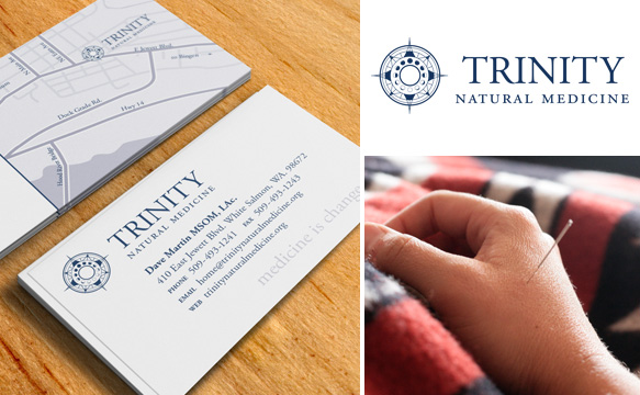

Photos by: Amarett Illustration by: Laura Martin
Trinity Natural Medicine
Brand and message development
Website design and development
Print and digital publication
Training and ongoing support